
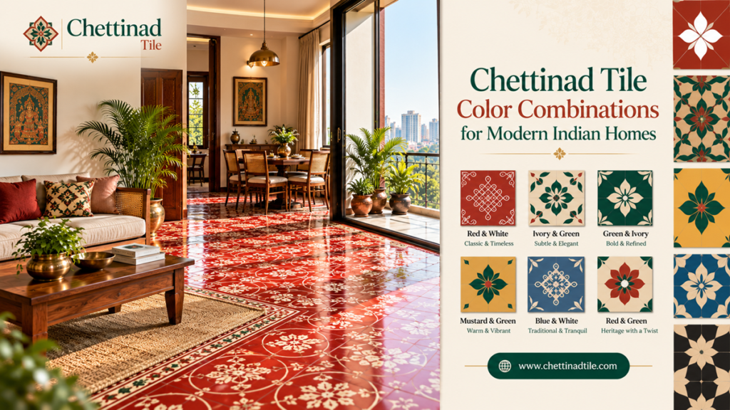
In an interior, a combination of colors can make a room feel warm, welcoming, and luxurious or fresh, modern, and spacious. The color of tiles affects the overall look of a room.
Chettinad tile color combinations are especially exciting for today’s Indian homes because they add a dash of everything – traditional craftsmanship, decorative designs, and colors that go well with up-to-date furniture and interiors.
Use Chettinad tiles in the main room, the foyer, a dining area, in a yard, a passageway or in strategic interior decoration zones. The design of the floor will not hide within the overall composition, but will be a key element of the interior design.
But selecting the colour combination is something you need to be a little bit careful about. You see, a heavily patterned floor looks totally different, based on the wall colour, furniture, natural light, wood finishes, curtains, and decor in the room.
Indian Home Decor Ideas- Chettinad Tile Combination: color combinations and designs for Indian home decor with images, ideas, and how to style modern indian style decor for the house and comfort.
Why Color Combinations Matter in Chettinad Tiles
Chettinad tiles are often recognised for their decorative patterns and combination of colors. Unlike plain flooring, patterned tiles can immediately attract attention.
The colour combination you choose can influence the visual character of the entire room.
For example:
- Warm colors can create a welcoming atmosphere.
- Neutral combinations can produce a sophisticated appearance.
- Darker patterns can create contrast.
- Light combinations can make a room feel brighter.
- Traditional colors can reinforce a heritage-inspired interior.
- Balanced contemporary combinations can work with modern furniture.
The key is to consider the floor as part of the complete interior design.
“A beautiful floor does not compete with the room; it helps bring the room together.”
This principle is particularly useful when working with patterned flooring.
1. Black and White Chettinad Tile Color Combination
Black and white is one of the most flexible color combinations for decorating a home.
A black and white Chettinad tile pattern can make a visual difference while being simple to match with many different types of furniture.
For a modern Indian home, this combination can work particularly well with:
- White or off-white walls
- Natural wood furniture
- Black metal details
- Neutral sofas
- Minimal decorative accessories
- Indoor plants
Where to Use Black and White Tiles
Consider this combination for:
- Entrance foyers
- Living rooms
- Dining areas
- Corridors
- Feature flooring
If the pattern is visually strong, keep the surrounding walls and furniture relatively simple.
Black and white Chettinad tiles can also work well in homes where the homeowner wants a traditional flooring pattern with a contemporary overall appearance.
2. Blue and White Chettinad Tile Combination
Blue and white Chettinad tiles are another-looking combination for homes that need a fresh and calming look. Blue can bring color without making the space feel too warm or heavy. When blue is paired with white, it can create a balanced look.
This combination can complement:
- White walls
- Light-coloured furniture
- Natural wood
- Beige upholstery
- Brass or metallic accents
- Indoor greenery
Best Spaces for Blue and White
Blue and white Chettinad tiles are a choice for living rooms, dining spaces, entrances, and courtyards, especially when the overall interior feels light and relaxed.
In rooms, choose a pattern that fits the available floor area. A complex pattern can overwhelm a compact space.
3. Terracotta and Cream Chettinad Tiles
Create a subtle earthy effect by using terracotta-based colors.
Terracotta often feels right at home in Indian interiors if used with cream or beige, as it goes so well with all natural finishes like cane, wood, stone, or woven textiles.
This color combination can work really well for owners who want to create a traditional look but still want a comfortable contemporary look in their home.
How to Style Terracotta and Cream Flooring
Pair terracotta and cream Chettinad tiles with:
- Wooden furniture
- Beige sofas
- Cream walls
- Cane or rattan accessories
- Natural fabrics
- Warm lighting
This combination can work especially well in living rooms, dining areas, verandas, and entrance spaces.
4. Green and Cream Chettinad Tile Designs
Green is often linked with nature. Can add a nice fresh feel to rooms.
A design that has green and cream can fit nicely if the rest of the space uses items and soft colors.
For instance, a modern living room that has cream walls, wood furniture, plants inside, and fabrics can go well with green and cream Chettinad tile designs.
Try not to add many bright colors. Let the floor be the decoration.
Ideal Applications
This combination can be considered for:
- Living rooms
- Courtyards
- Dining areas
- Entrance spaces
- Heritage-inspired interiors
For outdoor or semi-outdoor locations, always confirm that the selected product is suitable for the environmental conditions before installation.
5. Yellow and Grey Chettinad Tile Combinations
Yellow and grey Chettinad tiles can create an interesting balance between warmth and neutrality.
Yellow introduces energy and visual warmth, while grey can help moderate the overall appearance.
This can be useful in contemporary Indian interiors where homeowners want traditional patterned flooring without creating an excessively traditional room.
Pair this combination with:
- Light grey walls
- White furniture
- Natural wood
- Black accents
- Simple decorative elements
The result can be a modern interior with a subtle heritage influence.
6. Red, Black and Cream Chettinad Tile Patterns
For those who prefer a more substantial look in their traditional roofing design, mixes of red and black with creamy whites help draw out a beautiful visual impact.
This works very well with Indian style furniture, wooden doors, brass accessories, and warm lighting.
However, strong colors should be balanced carefully.
When the flooring has a mixture of bold colors, do not go the same way with colors of the same boldness.
Where This Combination Works
Red, black, and cream Chettinad tiles can be used in:
- Entrance foyers
- Traditional living rooms
- Dining areas
- Courtyards
- Heritage-inspired homes
The floor can become the primary decorative feature while the rest of the interior remains comparatively simple.
7. Beige and Brown Chettinad Tiles
If you prefer subtle flooring, beige and brown can be a practical color direction.
These colors work naturally with wood and neutral interiors and can create a warm appearance without excessive contrast.
Beige and brown Chettinad tile combinations can complement:
- Wooden furniture
- Cream walls
- Brown doors
- Neutral upholstery
- Natural stone
- Warm lighting
This is particularly useful for homeowners who like patterned flooring but do not want the floor to dominate the room.
8. Blue, Grey and White for Contemporary Homes
Modern interiors do not necessarily require plain flooring.
A carefully selected blue, grey, and white pattern can introduce traditional Chettinad tile craftsmanship into a contemporary space.
For example, consider a room with:
- White walls
- Grey sofa
- Light wood furniture
- Minimal artwork
- Blue and grey patterned flooring
The floor can provide color and visual interest while the rest of the room remains modern.
This is an effective approach to combining traditional Chettinad tile designs with modern interiors.
9. Earthy Color Combinations for Warm Indian Interiors
Earthy colors can create a comfortable and grounded atmosphere.
Consider combinations such as:
- Terracotta and beige
- Brown and cream
- Olive green and beige
- Rust and off-white
- Mustard and cream
These colors can complement interiors that use wood, textiles, plants, stone and handcrafted accessories.
I think that earthy Chettinad tile color combinations for homes work well when the goal is to create a warm and welcoming atmosphere instead of a very minimalist look.
10. Neutral Chettinad Tile Colors for Minimalist Homes
Patterned flooring does not always need bright colors.
Neutral combinations can provide the decorative character of Chettinad-inspired flooring while maintaining a contemporary appearance.
Consider:
- White and beige
- Grey and cream
- Taupe and white
- Light brown and ivory
- Soft grey and beige
These combinations are useful when you want the floor to have a pattern but prefer a restrained color palette.
Why Neutral Colors Work
Neutral flooring can make it easier to change furniture, curtains, cushions or wall colors
For homeowners who regularly update their décor, a neutral patterned floor can provide greater flexibility.
How to Match Chettinad Tile colors with Wall colors
Choosing the tile color is only the first step. The walls should also complement the flooring.
White Walls
White walls provide a neutral background for colourful patterned tiles.
Almost any balanced Chettinad pattern can work with white walls, but strong colors will become more visually prominent.
Cream or Beige Walls
Cream and beige walls can soften colourful flooring and create a warmer interior.
They work particularly well with terracotta, brown, red, green, and muted blue patterns.
Light Grey Walls
Light grey can create a contemporary background for patterned flooring.
It can work well with blue, white, black, yellow, and grey tile combinations.
Pastel Walls
Soft pastel colors can work with selected Chettinad patterns, particularly when one of the tile colors echoes the wall colour.
Avoid using too many competing colors in a single room.
How to Match Chettinad Tiles with Wooden Furniture
Wood and patterned tiles can complement each other very effectively.
Natural wood introduces warmth, while patterned flooring provides color and visual detail.
For example:
Wooden furniture + cream walls + terracotta and beige Chettinad flooring
can create a warm, traditional-modern interior.
Similarly:
Light wood + white walls + blue and white Chettinad tiles
can create a lighter and more contemporary appearance.
The important consideration is balance. If both the flooring and furniture have strong patterns, the room may feel visually crowded.
Chettinad Tile colors for Living Rooms
The living room is often the best place to use decorative flooring because it is one of the most visible areas of the home.
When selecting Chettinad tiles for living rooms, consider:
- Room size
- Natural lighting
- Sofa colour
- Wall colour
- Furniture material
- Curtain colors
- Pattern scale
For a bright contemporary living room, blue and white or grey and cream may work well.
For a warm traditional living room, terracotta, cream, brown, or red-based combinations may be appropriate.
For minimalist interiors, neutral patterned tiles can provide subtle decoration.
You can explore different design possibilities through the Chettinad Tiles design portfolio.
Chettinad Tile colors for Entrance Areas
The entrance is the first area visitors see, making it an excellent location for decorative flooring.
A strong pattern can create a visual focal point without requiring extensive wall decoration.
Consider:
- Black and white
- Red and cream
- Blue and white
- Terracotta and beige
- Green and cream
When choosing entrance flooring, consider the amount of foot traffic and the actual suitability of the selected product for the location.
Chettinad Tile colors for Dining Areas
I find that dining rooms can shine with inviting colors.
When I look at terracotta, cream, brown, red, and earthy green hues, I see how these colors pair nicely with wooden dining tables.
If the dining table looks heavy or highly decorative, I recommend choosing a tile pattern that stays balanced.
When furniture is simple, I say that the floor can carry the character.
Chettinad Tiles for Courtyards and Semi-Outdoor Spaces
Chettinad-style patterns can complement courtyards and traditional architectural elements.
However, color selection should not be the only consideration.
Before using tiles in a courtyard, veranda, balcony, or other exposed area, confirm:
- Product suitability
- Surface characteristics
- Slip resistance
- Moisture exposure
- Installation requirements
- Maintenance requirements
A beautiful indoor tile is not automatically suitable for outdoor use.
How Room Size Affects Tile Color Selection
Room size can influence how a tile color and pattern are perceived.
Small Rooms
For smaller spaces, consider lighter or moderately patterned combinations.
Examples include:
- White and beige
- Cream and light blue
- Grey and white
- Light brown and ivory
This does not mean dark colors cannot be used in small rooms. The overall lighting and design should be considered together.
Large Rooms
Larger rooms provide more space for stronger patterns and color combinations.
You can consider:
- Red and cream
- Green and beige
- Blue and white
- Black and white
- Terracotta and brown
For large spaces, also think about how the pattern repeats across the complete floor.
How Lighting Changes Tile Colors
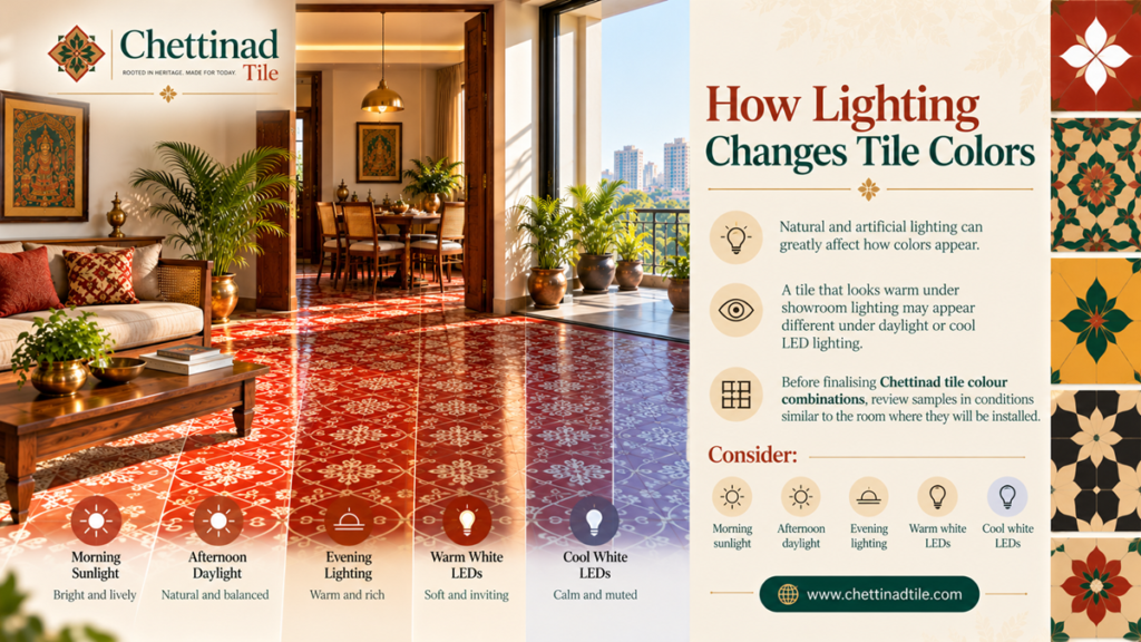
I have found that natural and artificial lighting can greatly affect how colors appear.
I have seen that a tile that looks warm under showroom lighting may appear different under daylight or cool LED lighting.
Before finalising Chettinad tile colour combinations, review samples in conditions similar to the room where Chettinad tile colour combinations will be installed.
Consider:
- Morning sunlight
- Afternoon daylight
- Evening lighting
- Warm white LEDs
- Cool white LEDs
If possible, compare the tile sample next to your wall paint, furniture, and wood finishes.
How to Avoid Too Many Colors
One of the most common design mistakes is introducing too many colors into one room.
If your Chettinad flooring already contains three or four colors, the remaining interior can be simpler.
A useful approach is:
Patterned floor + neutral walls + simple furniture + selected accent colour
For example:
Blue and white tiles + white walls + light wood furniture + blue cushions
This creates a coordinated appearance without making the room feel visually overloaded.
Traditional vs Modern Chettinad Colour Combinations
Traditional interiors often use warmer and stronger colors, while contemporary interiors may favour muted or neutral combinations.
However, there is no requirement to use traditional tiles only in traditional homes.
A modern apartment can combine:
- Contemporary furniture
- Minimal walls
- Modern lighting
- Traditional patterned flooring
This creates an interesting contrast between old and new.
“Traditional design becomes timeless when it is adapted thoughtfully rather than copied without context.”
The objective is not to make every part of the home look traditional. Instead, use selected Chettinad elements to add character to a modern interior.
Tips for Choosing the Right Chettinad Tile Color Combination
Before placing your final order, consider these points:
1. Start with the Room
Think about where the tiles will be installed and how the room is used.
2. Check Existing Colors
Look at your wall paint, furniture, doors, curtains, and other finishes.
3. Decide the Visual Priority
If the flooring is the main feature, keep other elements simple.
4. Consider Natural Light
A darker pattern can look different in a dim room compared with a bright room.
5. Review a Physical Sample
Whenever possible, compare a physical sample with the actual room materials.
6. Consider Pattern Scale
A design that looks attractive on a single tile may look very different when repeated across a large floor.
7. Plan the Layout
Borders, corners, doorways, columns, and room transitions can influence the final appearance.
8. Confirm Product Suitability
Do not select a tile based only on colour. Confirm that it is suitable for the intended application.
Common Mistakes When Choosing Chettinad Tile Colors
Choosing a Color Without Considering the Room
A tile should be selected as part of the complete interior scheme.
Using Too Many Strong Colors
If the flooring is highly colourful, balance it with neutral walls and furniture.
Selecting from a Screen Only
Digital images may not accurately reproduce colour and texture.
Ignoring Lighting
Always consider how the tile will look during different times of the day.
Choosing Pattern Without Planning the Layout
A repeating design needs to be viewed across the full floor rather than on a single sample.
Forgetting Maintenance
Consider cleaning requirements and the conditions of the intended location before purchasing.
Why Choose Chettinad Tiles for Modern Indian Homes?
Modern Indian homes often combine contemporary architecture with traditional materials, furniture, artwork, and decorative elements.
Chettinad tiles can contribute to this design approach by adding:
- Pattern
- Colour
- Craftsmanship
- Heritage-inspired character
- Visual depth
- A distinctive flooring feature
They can be used throughout a room or selectively in a particular area depending on the design concept.
To understand more about the company and its approach, visit the Chettinad Tiles About Us page.
Planning Your Chettinad Tile Purchase
Once you have selected a color combination, the next step is to plan the actual order.
Measure each flooring area carefully and calculate the required quantity. Consider cutting, layout requirements, and a suitable allowance for wastage.
For a larger construction or renovation project, confirm:
- Tile design
- colorcombination
- Dimensions
- Quantity
- Availability
- Delivery schedule
- Installation requirements
- Packaging
- Payment terms
Do not place a large order based only on a photograph. Review samples and product specifications before finalising the purchase.
Frequently Asked Questions
What are the best Chettinad tile color combinations for modern homes?
Popular design directions include black and white, blue and white, terracotta and cream, green and cream, beige and brown, and neutral combinations. The best choice depends on the room and surrounding interior colors.
Which Chettinad tile colors work well with wooden furniture?
Terracotta, cream, beige, brown, muted green, and blue-and-white combinations can complement wooden furniture effectively.
Are dark Chettinad tiles suitable for small rooms?
They can be, but the overall lighting, wall colour, pattern scale, and furniture should be considered. Lighter combinations may create a more open visual effect.
Can Chettinad tiles be used in modern interiors?
Yes. Patterned Chettinad flooring can be combined with contemporary furniture, neutral walls, modern lighting, and minimalist décor to create a traditional-modern contrast.
How do I choose a Chettinad tile colour for my living room?
Consider the sofa, wall colour, natural lighting, furniture material, room size, and desired visual style. Review a physical tile sample before making the final decision.
Can the same Chettinad tile colour combination be used throughout a house?
It can, but it is not necessary. Different spaces can use complementary patterns and colors while maintaining a consistent overall design theme.
Where can I see Chettinad tile designs?
You can explore the Chettinad Tiles portfolio for design inspiration and then contact the team to discuss your requirements.